Yes, a post about fantasy covers without actually showing any covers. There are plenty of ways to take a gander at some horrible (and excellent) fantasy covers without me spending my night collecting them for you. For the readily mockable, this place.
It is also well documented how vital a quality cover is to sales, and how vital a brand is to advertising. The cover is a form of brand for an author. It adds to a novel’s ‘collectable’ nature. Weaving themes through the covers of a series is very attractive. It implies to the reader that there is consistency within the novels as well. It shows planning and foresight. It can also be exceptionally cool or clever.
Of course, the covers can also be duds.
The ones that stick out to me are the ones with lizard men on them. Every time I want to mock a fantasy / sci-fi cover, I think lizard men. Usually either a) holding a screaming woman overhead, or b) being shot at by a woman in a silver space suit that ignores the shoulders. I also despise covers that are trying to sell fantasy using sex, because it rings of the ’80s and ’90s stereotype of fantasy lovers as basement nerds who require titillating covers to feel connected to a woman’s curvature. It rings of pulp. I want my fantasy to defy pulp. One of my favourite things about Game of Thrones on HBO is that it opened the world’s eyes to the very idea that fantasy is more than cliches and cheese. That the political machinations in Westeros can be as interesting and rich as ones in the White House.
The fantasy covers I prefer are more minimalist, have symbolism, and are connected to the story itself. They are never of massive battles, dangerous duels or nasty monsters – just a symbol and a correlated theme. The best example of this difference is between covers for Malazan Book of the Fallen:


The Bantam cover is everything I like. A backlit throne held by an imposing warrior? All in. Especially when the next few novels follow this pattern of black + coloured smoke + ominous central figure.
The TOR cover is everything I dislike, although this one is better than most of the others. Carriages just aren’t that interesting. The action scenes rarely capture any of the energy of battle, but instead tend to showcase characters like action figures. Plus every time I see a character in full light I immediately think “That’s not how I picture them.” Especially our good friend Silchas Ruin here as TOR’s covers came later than the original Bantam run.
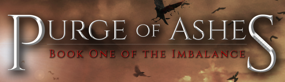
By this time in my 30 Days of Balance schedule I was supposed to have a cover ready. It would not be a stretch considering Purge of Ashes is being released in less than two weeks to say it is late. What matters is that it is finished and ready for press time. Alas, this may not be the case. Here’s hoping this crisis yields opportunity, because I can’t imagine looking at my first novel, finally done, finally fit for print, finally ready for the world – and be repulsed by the face it wears.
JM
